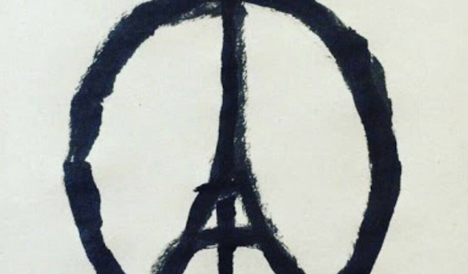
Merci à Jonathan Trajkovic pour cette analyse. Nos pensées vont vers toutes celles et tous ceux touchés de près ou de loin par cette tragédie.
EDIT 18/11/2015 : Jonathan Trajkovic explique ses choix concernant cette data-visualisation.
Why this data-visualisation ?
I did this data-visualisation because I was really moved by all these attacks. Victims were in my age group… I live in Paris Xe so it was in my neighbourhood… I love going to concerts, drinking a beer with friends… being alive finally ! It was a way for me to pay tribute to victims.
Why these data?
I chose to use aggregated data because I did not have so much time. But I was really interested by row data with geolocations, users… I was also interested by retweets and bookmarks. In fact I would have loved to have each tweet… But as I told before, I did not have so much time.
Why did I choose a red color palette for all the story?
It was difficult for me to choose a design. I tried different palettes but none was good enough. When I tried the red palette, I told myself « Wow ! This is really agressive ! » and I thought about it a long time. I chose to use this even if it is agressive because, indeed, #ParisAttacks were really agressive… When my colleagues and friends looked at my visualization, they told me that there is too much red and it is agressive. I told them that it is the aim of red palette. I want readers to have the same feeling than me about #ParisAttacks. Apparently, it is working…
Why did I choose a story?
First I tried to do the visualisation in a one page presentation. But when I looked at the data and how hashtags move, I told myself a story could be a good solution. So I put annotations, corresponding to events Firday night, to comment hashtags’ variations.


Sections commentaires non disponible.